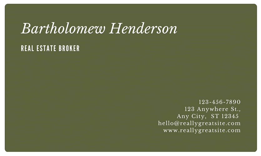
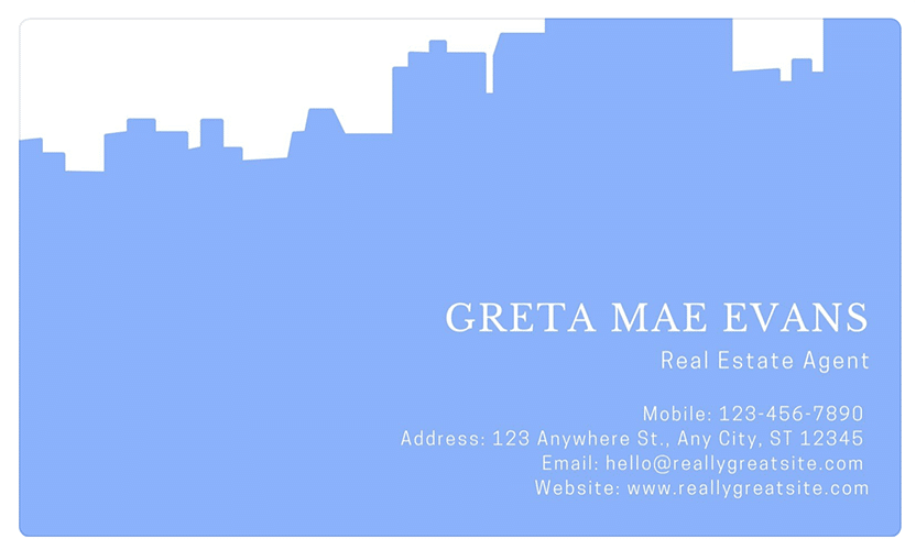
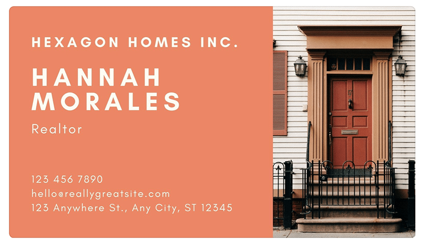
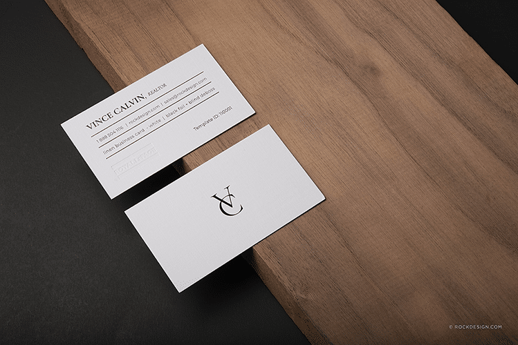
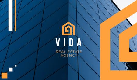
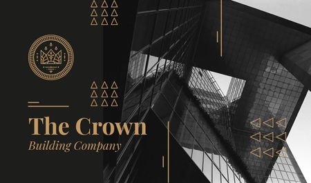
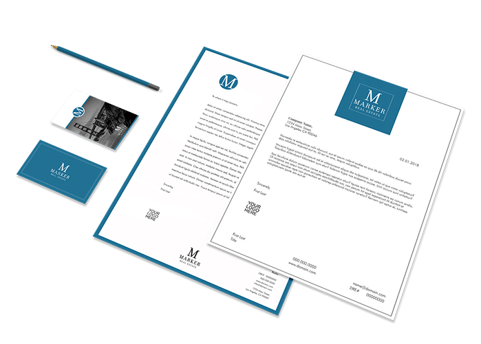
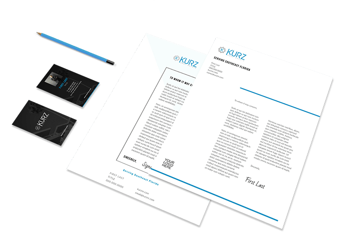
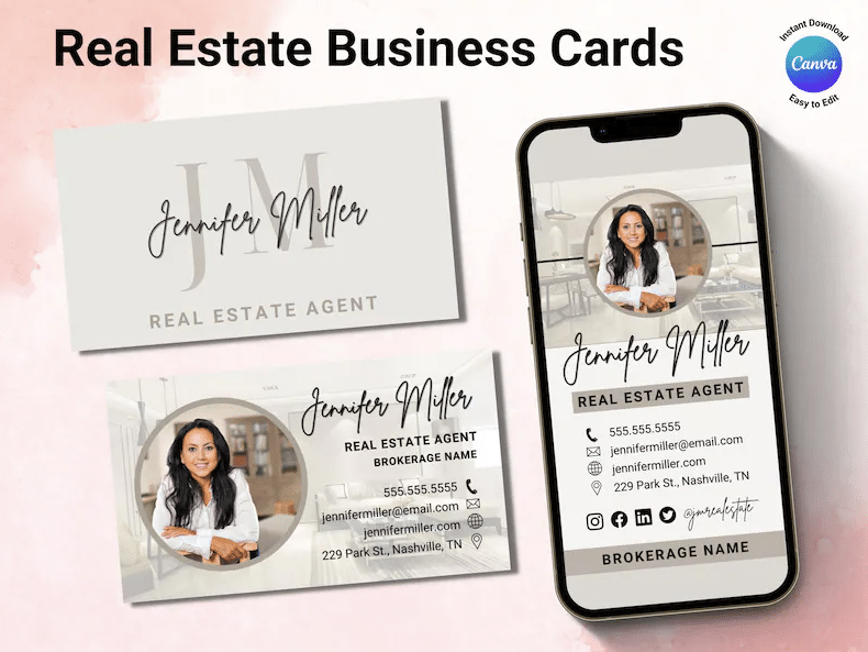
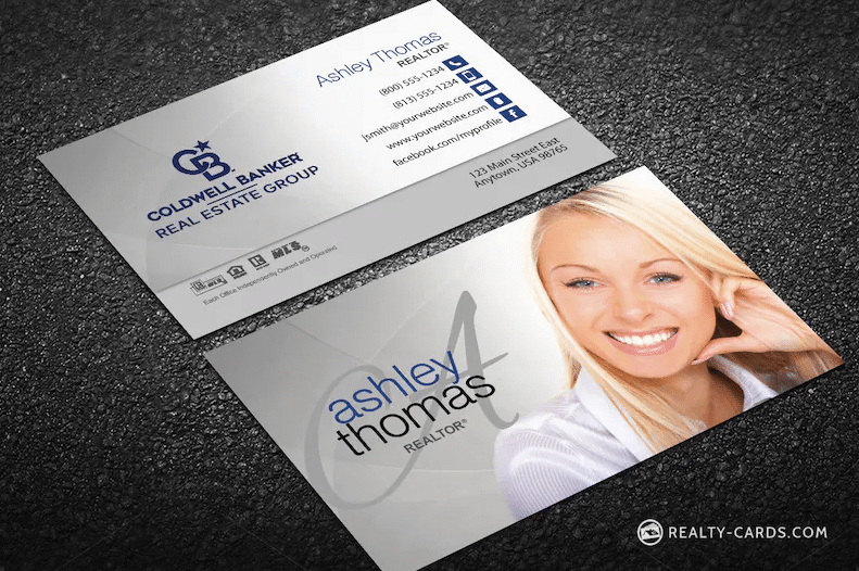
First impressions matter. Even if your business is 100% online, real estate business cards with sophisticated designs are a crucial part of your personal brand. Handing your next prospect an eye-catching card that feels luxe can do wonders for your career. Sure, they’re old school, but so are a lot of homeowners.
To help you nail your next meeting, we gathered our 18 favorite real estate business cards, plus seven cringe-inducing design mistakes to avoid. Use our list of affordable providers to help you design and print your cards without breaking the bank. We’ve included our real estate branding guide to help you polish every aspect of your personal brand—from start to finish.
18 Real Estate Business Cards We Love
1. SERHANT.

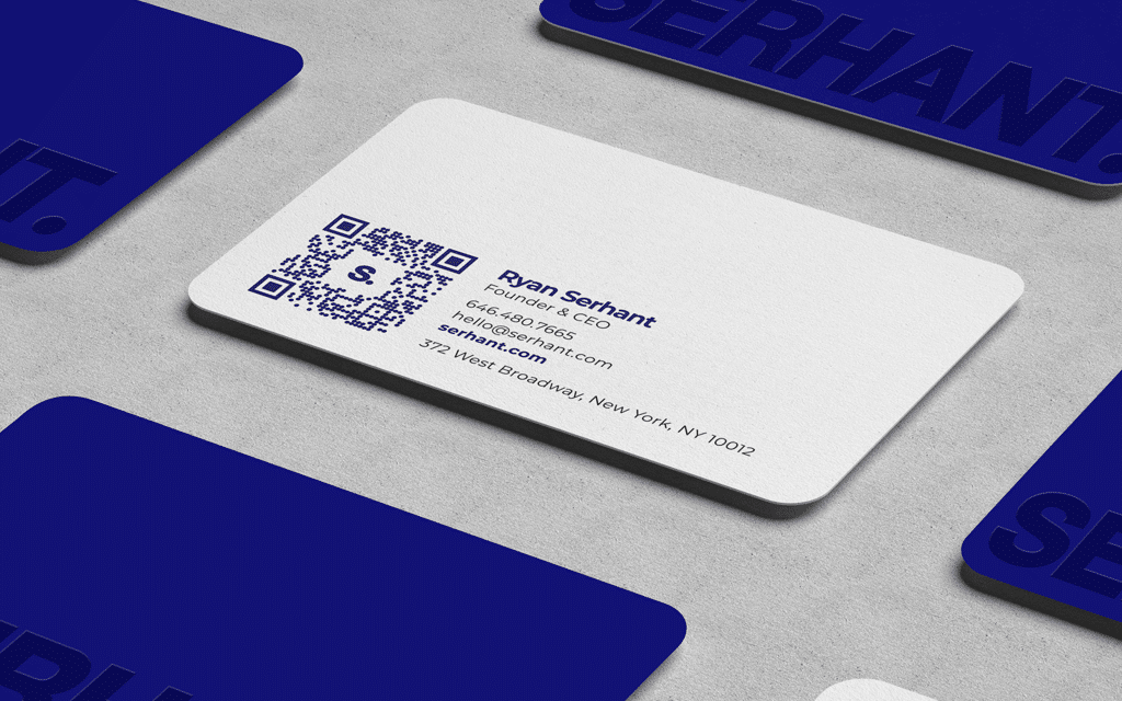
Why We Love It: Ryan Serhant worked with a graphic designer to create a show-stopping visual identity for SERHANT. that effectively relays his brand’s core identity. These beautifully designed, luxury real estate business cards are a strategic marketing tool that communicates his personal and company brand to the world.
The blue signifies trustworthiness. The bold, all-caps Helvetica typeface communicates his brand adjectives (successful, limitless, polished), and the period is a not-so-subtle way to tell potential clients the SERHANT. Brokerage is the clear choice to sell their luxury property.
If you want to learn how to use the Serhant Brand Strategy System to develop your brand, check out Ryan’s “How to Build Your Personal Brand” course.
2. Century 21

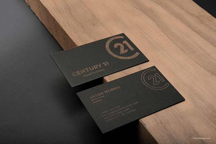
Why We Love It: While we haven’t exactly been quiet about our love of the Century 21 rebranding, their color theme, refreshed logo, and brand mark look especially great in the flesh. These new cards for Century 21 are no exception. They manage to be subtle and elegant without being pretentious, and they’re just daring enough to be interesting.
To get a sense of what I mean, how easy would it have been to go all-out and foil stamp the logo in metallic gold? While that might actually look pretty slick, it would kill the approachable high-end vibe their new branding has in spades. These real estate business cards look expensive, but not flashy.
3. Hilton & Hyland

Why We Love It: Check out these too-cool-for-school business cards for the Cumming & Beisel team at Hilton & Hyland Christie’s. Perfect for the swanky Beverly Hills market that loves a chrome Bentley hood ornament as much as a black, chrome-foil-stamped business card.
4. The Perry Apartments

Why We Love It: The Perry is a luxury development in Potomac, Maryland, that easily meshes with the Williamsburg, Brooklyn, aesthetic. These bright yellow real estate business cards feature high-end finishes, sleek modern design, and our favorite aspect—a gorgeous, retro-themed brand—to match. The memorable layout, colors, and typography all work perfectly for The Perry brand.
5. 520 Park Avenue

Why We Love It: Real estate branding agency The Seventh Art created this stunning card for 520 Park Avenue, a luxury building on the Upper East Side of New York City. The restrained design allows the formal type, slate gray, and creamy white to convey a timeless elegance.
While not trendy or flashy, these real estate business cards stand out with a calm confidence, much like the 64-story limestone high-rise address. These cards show that sometimes, the simplest approach is the most effective and attractive.
6. Brown Harris Stevens Development Marketing (Formerly Select)

Why We Love It: With a history dating all the way back to 1873, New York City luxury brokerage Brown Harris Stevens knows a thing or two about great branding. That’s why it’s not surprising that these real estate business cards for its ultra-exclusive new development marketing division are drop-dead gorgeous.
Just bold enough to hint that they’re staying on the cutting edge of property marketing and subtle enough not to make waves at an East Hampton polo mixer, these cards walk a fine line and walk it well. During its restructure in 2020, where BHS and Halstead combined under one name, the firm completed a top-shelf rebrand worthy of its historic lineage. We covered this more extensively in our article on branding. But since we’re here, just check out the revamped logo and slogan. Pure genius, right?

7. Seven Harrison, Tribeca

Why We Love It: The Seventh Art proved itself again with this eye-catching, artistically styled card for the Seven Harrison Building in Tribeca.
The cool, bright orange color palette contrasted against cream and the stark black back packs a big punch. The thin-line drawing of the building at an angle in the corner is just the right amount of illustration.
Once again, the agency delivered a design that conveys an aesthetic sensibility and cool factor that is perfect for the building and neighborhood. These real estate business cards might just be pretty enough to frame.
8. The Vandewater
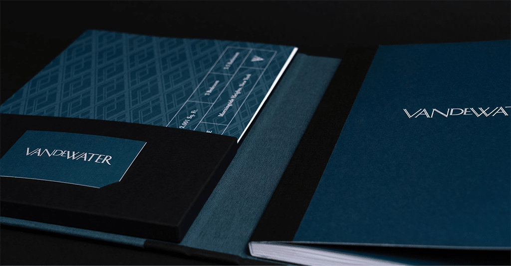
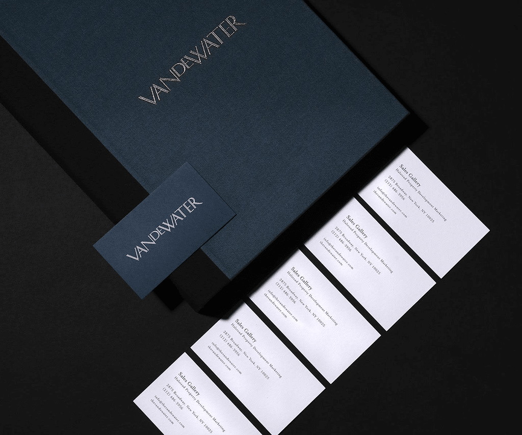
Why We Love It: We’re reminded again why The Seventh Art is one of the most celebrated agencies for New York luxury development design work. The Vandewater is a new building designed to fit into a historic neighborhood, blending in with Columbia’s neo-classical facade and nearby gothic spires.
Their real estate business card design had to give a nod to history, but promise luxury. The deep, rich navy blue is soothing and timeless, and the typeface harkens back to an age of classic New York.
The design and cards are confidently minimalistic and skew masculine, calling to mind a beautifully tailored suit.
9. Fox Real Estate

Why We Love It: Meanwhile, on the other side of the Atlantic, Adelaide’s Fox Real Estate went with a clever, bold approach for its business cards and branding.
These cards hint at semaphore, art deco, and even modern art, but they actually reference fox hunting. Can you imagine getting this card after a frustrating experience with a lesser brokerage? Talk about a reassuring tagline.
This is branding done right. Cheeky but not obnoxious, bold but not over the top, and there is an actual message behind the pretty imagery.
10. One Eleven Murray Street

Look at that subtle off-white coloring. The tasteful thickness of it. Oh my God, it even has a watermark…
Ha-ha. Sorry—couldn’t resist working that quote in … If you know what this is from, ping me on X or Pinterest for a top-secret free prize. Anyway, back to the cards…
Why We Love It: One of the world’s most serious branding agencies, Pentagram, designed these cards for a jaw-dropping Tribeca condo development.
The vertical layout is ideal for this skyscraper coming in at 64 floors, and the marble and embossed logo on the front gives a subtle nod to Tribeca luxury.
And that was definitely the challenge here. After all, glittering glass skyscrapers are a little more Battery Park than Tribeca. One could easily lose Tribeca street cred by going tacky and modern. The marble ensures that’s not even a consideration.
11. The Cape

Why We Love It: SDCO Partners brings us another stunner with their design project at The Cape. The challenge was to bring to life a new development on Kiawah Island that also has a location in South Carolina.
The Cape is a development that will appeal to those comfortable in Palm Springs and Palm Beach—buyers searching for understated elegance and assured luxury. SDCO delivered with this bright citrus card that evokes the glamor and sunshine of jazz-age H^otel du Cap. The sherbet colors in a sun umbrella stripe make one crave a cold, frothy drink and a penthouse in a glorious new-build on the beach.
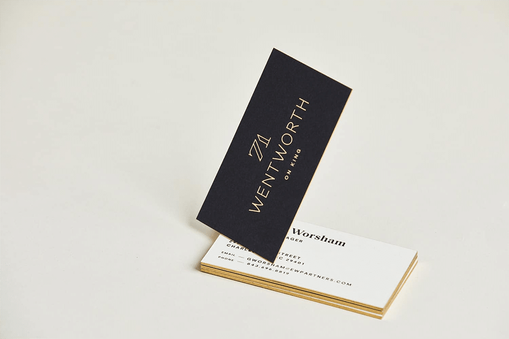
12. 71 Wentworth
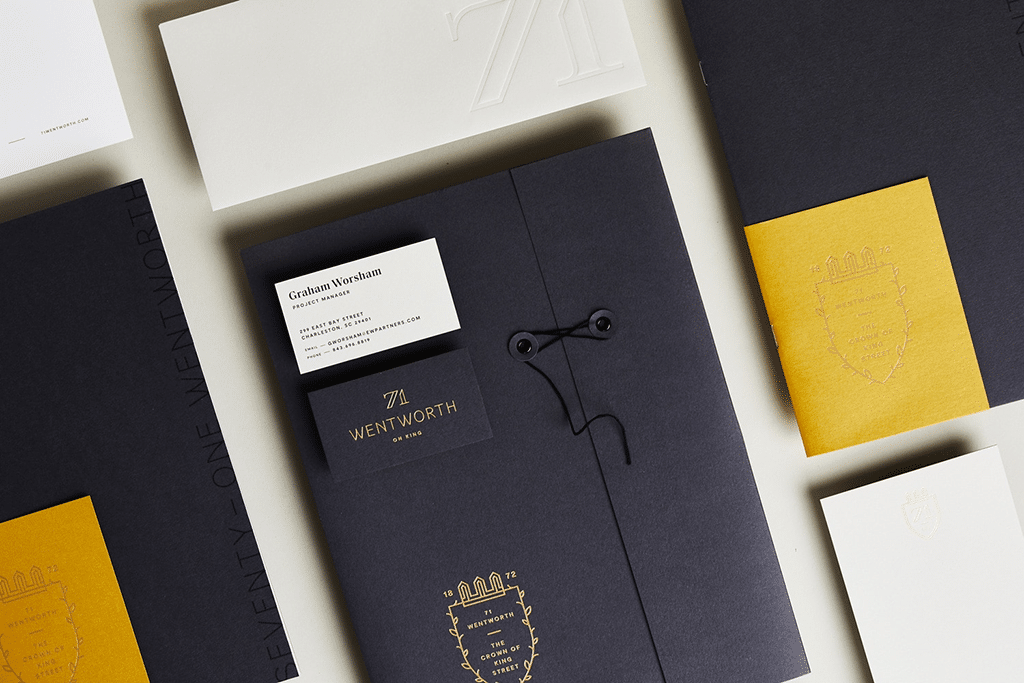
Why We Love It: Let’s look at one more real estate business card design from SDCO Partners. 71 Wentworth is a storied building in Charleston, South Carolina’s dynamic retail district along King Street. Like the Vandewater, the art direction plays masculine and restrained. The color palette—a bold slate black offset by French yellow, gold foil, and creamy white—shows confidence, style, and a strong identity.
The cards themselves are thick and solid, just like the building—a 19th-century Tudor Gothic Revival and former Masonic Temple. Proclaimed the Crown of King Street, its real estate business cards are perfectly regal.
12. Leading Real Estate Companies of the World

Why We Love It: When Leading Real Estate Companies of the World, a trade group that promotes the most exclusive brokerages on the planet, decided on a complete rebrand, they chose to work with famed real estate branding agency, 1000watt.
With the new look, they wisely chose to go timeless, rather than hip and trendy. The result is a lovely script typeface that wouldn’t have looked out of place on a logo in 1925. Or 1965. Or 2015.
The deep, rich-blue background gives an otherwise staid and traditional logo a bit of playfulness and punch and brings it safely into the 21st century.
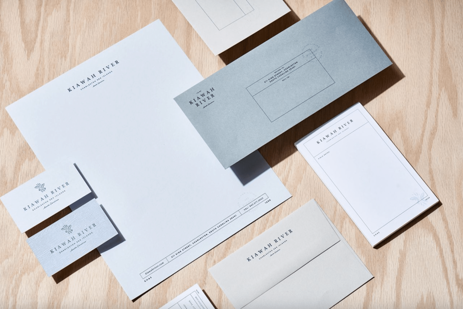
13. Kiawah River
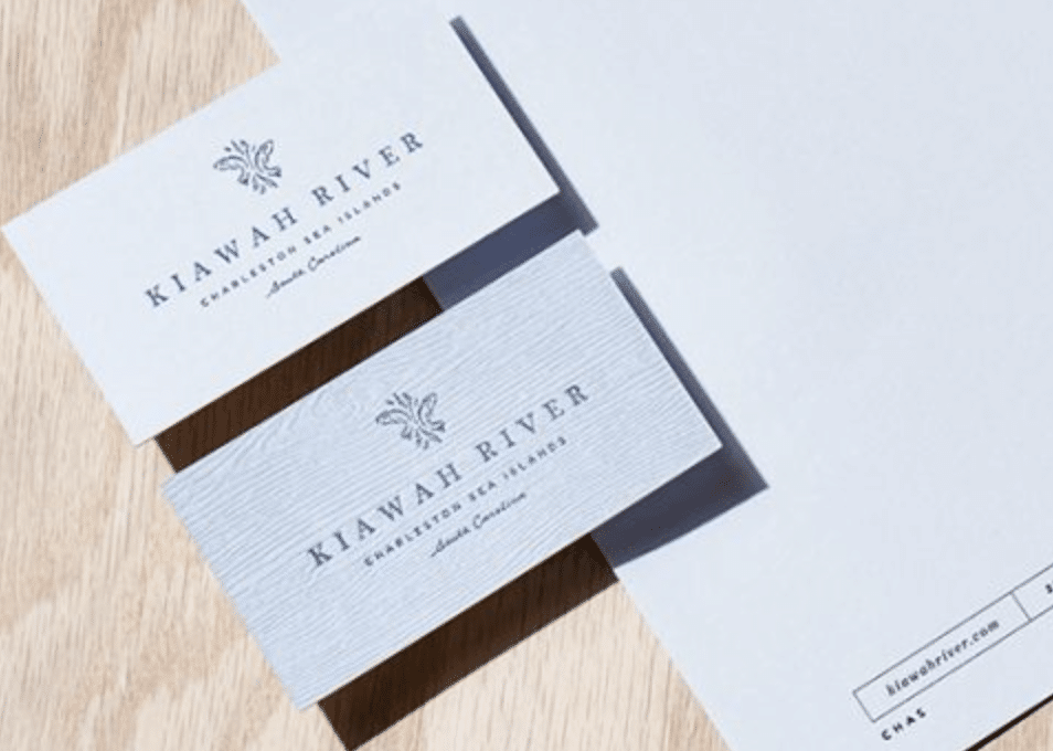
Why We Love It: When SDCO Partners was tasked with creating a brand for a new development near Kiawah Island, South Carolina, that spoke to its natural setting, the Kiawah River development was nothing but a vision. The art direction for the collateral was responsible for conveying luxury, connection to nature, relaxation—and most of all, possibility.
These cards really nail a sense of place: the twin redfish jumping in the logo, and the clean, laid-back, all-caps typeface. These real estate business cards lack formality, but not sophistication. We especially appreciate the grain texture included in the design suite, a nod to the large live oaks that dot the property.
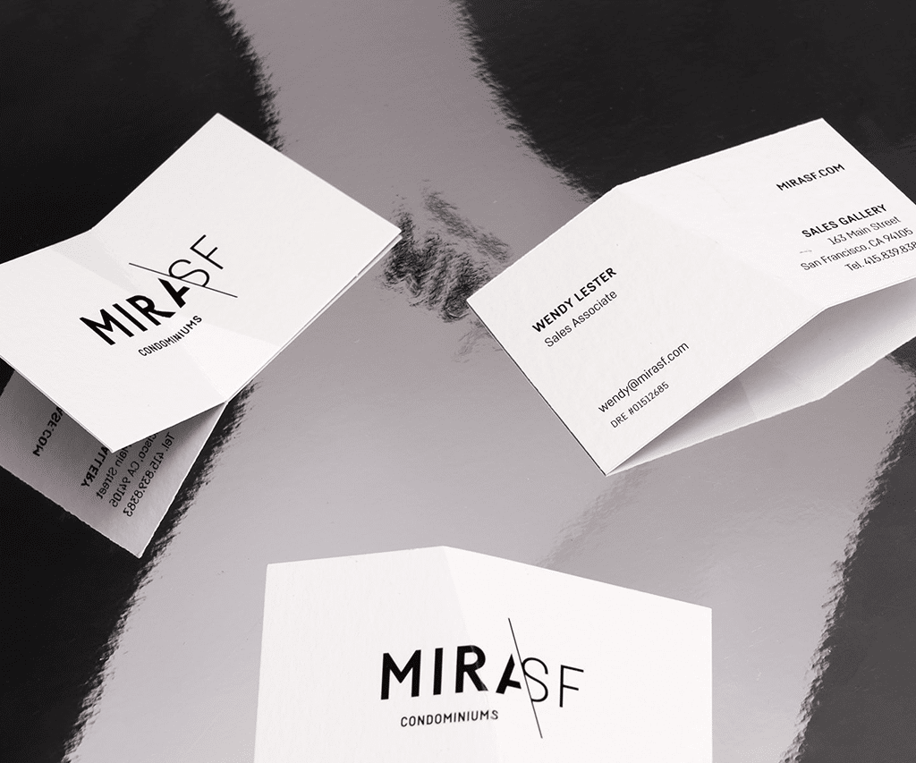
14. The MIRA SF
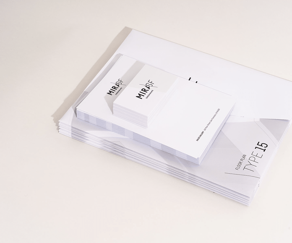
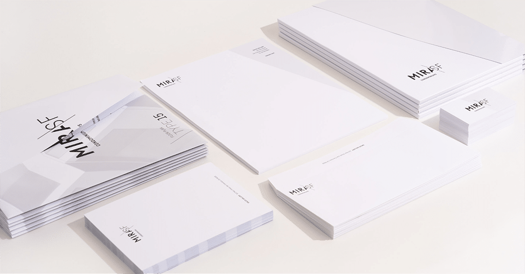
Why We Love It: The Seventh Art did another beautiful job with MIRA in San Francisco. A complete departure from the buttoned-up elegance of the Upper West Side, this building is edgy and modern.
The design plays with angles and architectural details, reflecting the grid-and-glass concept behind the building. Each piece tells the world that this building is unexpected and completely unique. It brings to mind a 1980s sensibility of modern design, which makes it perfectly on-trend for today.
15. The W Collection From Windermere Real Estate

Why We Love It: Designed by 1000watt, the collateral for the W Collection from Windermere complements its collection of ultra-exclusive waterfront Washington mansions so opulent Bill Gates would blush.
The brand mark is suitably master of the universe and wouldn’t look out of place on a priceless car or emblazoned on the door of an ultra-exclusive private club. Black and gold was the natural choice here, but they added in nice touches like debossing, and the foil stamps seal the deal.
How to Own It
Hire a graphic designer to create a stunning logo for your business. Then showcase your fancy new logo on everything, including your real estate business card.
The Best & Worst Real Estate Logos (+ Pro Design Tips)
16. Morley Brokerage, Bahamas
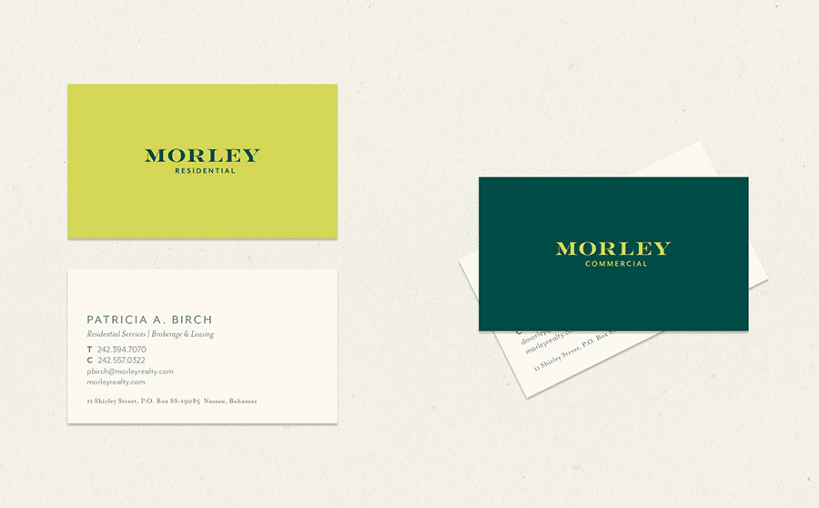
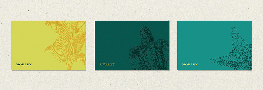
Why We Love It: Going from ultra-high-end to island cool in a single bound, next up we have another design from 1000watt. This look is one of our favorites as the design is boldly unafraid to anchor itself in the locale using organic shapes. The color scheme is fresh and bright, with colors that reflect the sea and sun.
But the typeface is classically tailored and formal, reminding us that it might be the tropics, but when it comes to real estate and marketing, these are serious professionals.
17. Henshaw Fox

Why We Love It: There’s bold and cool, and then there’s bold and cool. These real estate business cards for U.K.-based Henshaw Fox are definitely the latter. This electric green shows us that you can be bright, playful, and interesting at the same time.
The Canary Wharf startup vibe on the front is toned down a bit with a minimally styled back, but that geometric fox head logo brings us right back to hipster-tech.
18. Will Doyle, RE/MAX

Why We Love It: Speaking of leaning on your brokerage, these bold red cards from RE/MAX agent Will Doyle just work. Being big, bold, and bright red is always an unforgettable statement. We also like the understated image of a skyline. This is a design by 99designs, the design service arm of VistaPrint—more about them below.
Mistakes to Avoid: 7 Cringe-worthy Real Estate Business Card Fails
1. Too Much Clutter

Look, we get it. Even if you’re doing great, money is money. Spending extra for back-and-front printing can add up. Here’s the thing though—you’re going to have to sacrifice something. Trying to jam a million and one words onto one side of a card will look overwhelming.
2. Trying to Shoehorn Your Hobbies Onto Your Cards

Yes, we said incorporate your personality, your whole human self, into the design of your business cards. But your interests—like the type of TV shows or movies you spend your downtime watching—shouldn’t overshadow your professional side on your business cards. Leave something for those conversations over coffee to help you make deep connections with your prospects.
3. Using Cheesy Stock Real Estate Photos

OK, you work in real estate—I already know that because not only did you tell me when you handed me your card at a real estate showing, but it also says the name of your brokerage and the word Realtor next to your name.
Instead of splashing out on full-color printing for cheesy pictures, why not spend a little more time getting your layout and typography to look more sophisticated?
4. Bad Photoshop

Yes, your cousin’s brother’s nephew has Photoshop. No, that does not mean he knows how to use it properly. Cut-out headshots, cheesy pictures, and weird text effects all scream 1995 and have no place on your professional real estate business cards.
5. Ignoring the Business Card Etiquette of Other Cultures

Even if you’re working in the middle of nowhere in North Dakota, chances are if you do enough deals, you’re going to work with people from other cultures.
Most countries have very similar business etiquette practices as the United States, but China and Japan are major exceptions. In Japan, they have a whole business card ceremony called meishi koukan (名刺交換). You’ll want to make sure you hold your card with both hands from the top corners and make sure it faces the right way for the person you’re giving it to.
When working with someone from China, you’ll also want to hand over your card with both hands. Don’t give out cards while sitting, and use a card case. You should never hand anyone a wrinkled or creased business card—this is actually an insult in Chinese business culture.
6. Odd Shapes

The novelty of long, skinny real estate business cards lasted about as long as it took one to get lost in the card pocket of your wallet. And these always get lost in the card pocket of wallets. I think I have at least one buried in a deep dark recess of my wallet right now…
7. Taking Advice From This Guy
This might sound a little hypocritical, but you should take all of our advice here with a grain of salt. Yes, we’re design snobs, and yes, we have decades of combined experience in real estate and marketing, but always remember this is your card.
Whatever you end up doing, just make sure you either hire a professional or get their advice before you send your cards off to the printers.
Where to Get Real Estate Business Cards That Slay
Now that you’re inspired by some of our favorites, and you know what mistakes to avoid, you might be wondering where to get your own elegant real estate business cards.
If you have the resources to work with SDCO Partners, Seventh Art, or 1000watt, by all means, do it. These branding agencies are some of the best in the world specializing in real estate design.
But if you’re not quite ready for Madison Avenue, consider the options below. These sites offer myriad templates and various pricing options, and we’re sure you’ll find one that fits your style, brand, location, and budget.
| Company | Pricing | Offerings |
|---|---|---|
| Canva Pro | $120 per year subscription | Tons of customizable templates; ability to import templates from third-party sources |
| Fiverr | $25+ per project | Logo and business card design; freelancers you can hire for any a la carte design |
| RockDesign | $110 - $310 per 250 cards | Templates + printing; additional design elements available a la carte |
| VistaCreate Pro | $120 per year subscription | Thousands of customizable premium templates; ability to print |
| MOO | $21 - $60 for 50 cards | Templates and variety of cardstock to choose from; ability to upload your own design |
| LCA Marketing Center | $59 per user, per month | Templates + variety of cardstock to choose from; print from inside the platform |
| Etsy | $5 to $29 | Templates that can be customized in Canva; some sellers offer finished cards with printing |
1. Canva Pro
A Canva Pro subscription costs about $120 annually or $15 monthly and gives you access to the templates you see below and many more. You can design your own cards, hire someone on Fiverr to design a Canva template that’s unique to you, or purchase one already created by an Etsy designer. Using customizable templates puts you in control of your cards and allows you to change them easily when you need to.
2. Fiverr
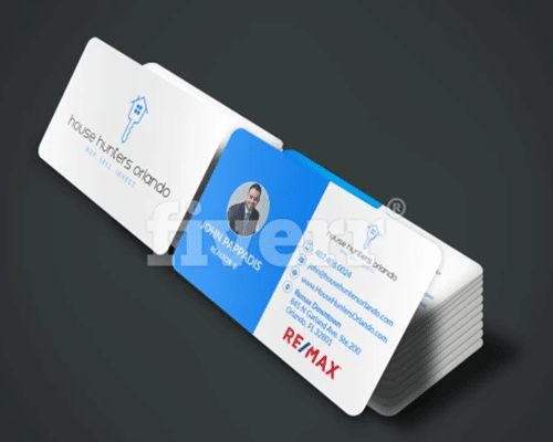
Use Fiverr to find talented designers from all over the world who can design your card quickly and cheaply. Prices are surprisingly affordable, starting at as little as $5 or $10. You can hire a designer to create a logo for your business, and then design a business card and all of your marketing collateral around it.
3. RockDesign
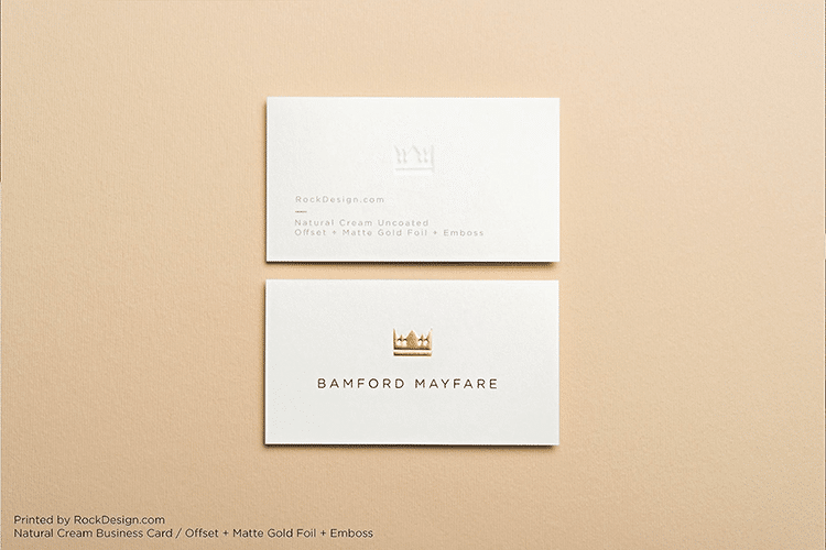
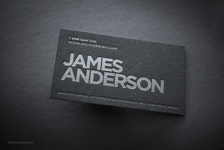
RockDesign offers plenty of high-quality templates. Luxury cards cost $310 for a set of 250 while the classic ones run about $110. You can even get a set of 50 eye-catching metal cards for $220. They also offer graphic design services if you’re still trying to nail that perfect logo.
4. VistaCreate
VistaCreate is the design arm of VistaPrint. They have a collection of ready-made templates for social media marketing and advertising. You can even develop entire brand kits on the platform. One of the coolest benefits of a VistaCreate Pro account is that you can print directly through VistaPrint.
5. MOO
We like MOO.com’s selection of real estate templates, plus they have pretty reasonable pricing. A set of 50 business cards will run $20 to $60, depending on cardstock and design elements you add. With MOO you can either use their templates or upload your own design.
6. LCA Marketing Center
An all-in-one design solution, LabCoat Agents (LCA) Marketing Center offers top-notch, professional designs specifically for real estate agents. Pricing scales based on the number of users, running $59 per month for an individual subscription. LCA Marketing Center offers tons of templates for all of your marketing, including digital, social media, and print. You can create an entire marketing plan and even order printed materials from inside the platform. Pretty cool for just $59 per month.
7. Etsy
We think Etsy is underutilized in the real estate world. We find so many amazing designs over there and more often than we should be clicking “add to cart” for some of the amazing Canva-compatible templates. Check out some of the cool designs that include print business cards coupled with a digital version. You can also find sellers who deliver the final product, just like that cool real estate T-shirt you ordered. All you have to do is fill in your info and they print and deliver your business cards directly to you, no designing needed.
8. Your Local Marketing Agency
We’ve shared several online companies you can tap into to find great real estate business cards. But what we can’t do is highlight local businesses in your market. You may be sitting on a gold mine with a marketing company, almost as talented as those fancy Madison Ave designers, right in your own backyard. Plus, they’ll likely understand what resonates with your local market a bit better.
Go talk to some of them and see what their level of design is and talk over some options. You may be surprised to find someone you can sit down with and discuss your vision and have them create an entire brand kit for you at a reasonable price. Best of all, you’ll be supporting a local business right in your own market. That’s a huge win–win!
6 Tips to Make Your Real Estate Business Cards Stand Out
We do realize that most business cards are kind of boring. But these tips can help your cards make the biggest impact possible on your potential customers.
1. Add a QR Code
You can create a scannable QR code for free from any number of generators online or directly inside Canva Pro, so you no longer have an excuse not to use one of these. Send your prospects to a landing page or a link in bio. Give your potential clients more stuff to explore quickly and easily. Don’t forget to give them something of value and include a call to action (CTA).
2. Add a Digital Version
Don’t miss out on the opportunity to immediately get inside someone’s contact list with a digital card. And no, we’re not just talking about a PNG of your card you saved in your photos. Real digital cards can send your information directly to a prospect’s contact list. And in exchange, you get their phone number, which makes it a lot easier to follow up later.
3. Don’t DIY
We’ve shared a lot of ways you can create your own business cards in this article, but if you’re not particularly gifted in graphic design, you shouldn’t try to do it all on your own. Hire a freelancer from Fiverr or use a service like LCA Marketing Center or RockDesign to create your overall branding. You need a professional to get you started. Spend some time upfront creating your logo and tagline before you work with a pro. And ask your peers what they think when you get some demos before you settle on your final design.
4. Ask Where It Came From
When you meet someone and they hand you a sweet business card, ask them where they had it made. It doesn’t matter what industry they’re in when they hand you a card that strikes you. Find out where they had theirs made and reach out to that company.
5. Go Big on Quality, Not Quantity
It’s difficult to spend a lot of money when you’re first starting out. So, don’t get 1,000 cards in your first batch. (Some of us still have a stack of our first cards in a box in a drawer.) Order a smaller number so that you won’t be wasting so many cards when you’re ready to move to a new brokerage or bump up your design to the next level. You should spend as much as you can afford to make your cards as high-end as possible. It’s like what they say, “Dress for the job you want, not the job you have.” Your cards should convey the level you want to be at, not where you’re starting.
6. Evolve
Your business will change over time. Your business cards should evolve in design and style as your business grows and develops. Check in every so often with your branding and make sure it still represents your mission, vision, and values. If not, maybe it’s time for a little updating or possibly a complete rebranding.
Over to You
Work for a brokerage with exceptional, uniquely designed, or unconventional real estate business cards? We’d love to see ’em! Show us in the comment section!


