Real estate ads should do more than just make your phone ring. If you put in the time and effort to really connect with your local community, your ads can actually help build your personal brand to market you as the go-to real estate expert in your farm area. They are that powerful!
To help inspire you to create ads that make your phone ring and help build your brand, we put together this freshly updated list of 28 examples of clever real estate ads for 2023. You’ll also get our analysis of the ad’s lead magnet, copy, and design to prove making great ads isn’t as hard as you think.
Real Estate Social Media Ad Examples
Advertising on Facebook and Instagram is still popular with agents for a very good reason. These platforms let them laser-target leads on the exact demographic they’re trying to reach. All you need is a great idea, a lead magnet, catchy copy, and clever creative, and you can start generating leads on Meta’s flagship platforms.
To get you started, here are some examples of highly effective Facebook real estate ads and our take on why they work so well.
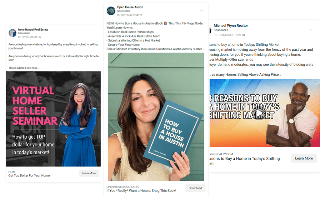
1. Buyer Quiz Ad

Lead Magnet: Buyer’s quiz
Why This Copy Works: This copy starts by building on first-time buyers’ FOMO (fear of missing out) and then cleverly offers a solution. Notice also how it speaks directly to the person reading instead of a general audience.
Why This Creative Works: Instead of a picture of houses, they went with a picture of the agents teaching the course. They look friendly and approachable enough to not intimidate the first-time homebuyers they’re targeting.
Pro Tip
Don’t have the time or patience to learn Facebook ads? Top Producer Social Connect makes it easy. Just enter your city and budget and Top Producer’s team of advertising experts do the rest. Even better, you’ll get a suite of automated lead nurturing tools to keep them warm while you work with clients.
2. Reasons to Buy a Home Video Ad
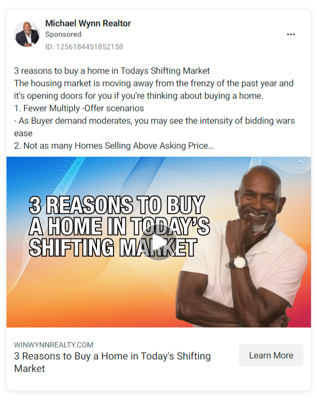
Lead Magnet: Video
Why This Copy Works: Targeting fence-sitters (and who can blame them in this market!), this copy lays out three of the reasons this agent thinks now is a good time to buy.
Why This Creative Works: Bold text, a brightly colored background, and a friendly and professional picture of the agent draws potential buyers in.
3. Home Valuation Ad

Lead Magnet: Free home valuation
Why This Copy Works: It’s simple and straight to the point. Emphasizing the word “free” helps draw in people who have not sold a home before and don’t know that all home valuations are free.
Why This Creative Works: While the layout is a little crowded, we love how the agent added a casual yet professionally shot picture of herself. Too many home valuation ads use bland generic graphics, and we would bet this one converts much better.
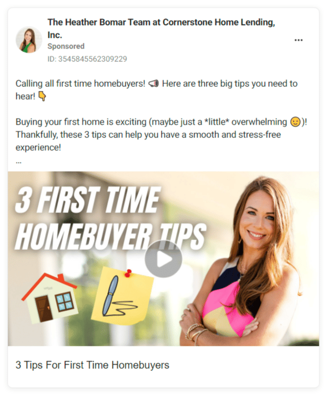
4. First-time Homebuyer Tips Video Ad
Lead Magnet: Video
Why This Copy Works: This language is light and fun, but gets straight to the point and uses emojis to guide the reader through the ad.
Why This Creative Works: The title of the video is bold and draws your attention thanks to the italic font. The agent looks friendly and approachable, but still professional.
5. Simple Exclusive Listing Ad
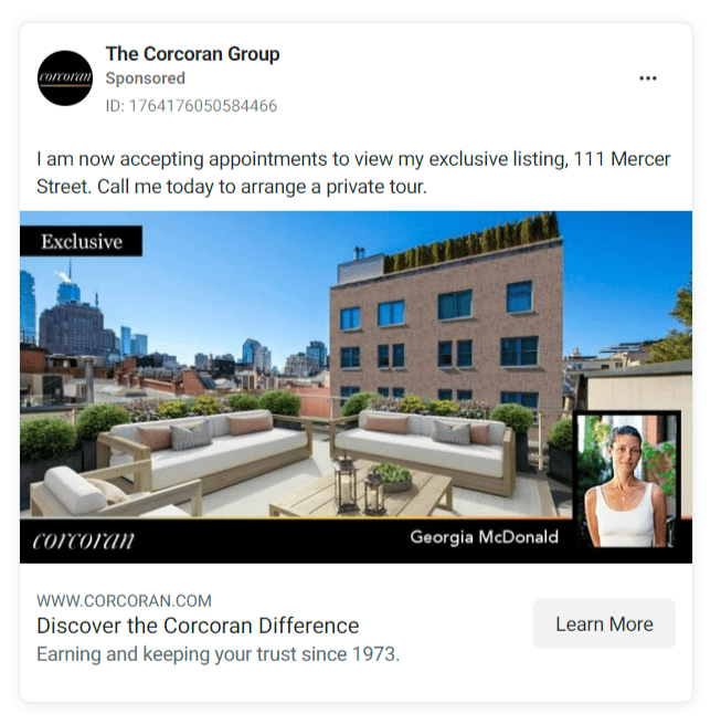
Lead Magnet: Private tour
Why This Copy Works: With only one sentence, this copy cuts through the noise on social media and gets straight to the point. Using the terms “accepting appointments” and “private tour” makes the listing sound exclusive and her time sound valuable.
Why This Creative Works: Also dead simple, but very effective: gorgeous photography, brokerage branding, and a headshot in the lower right corner. Perfect.
6. Simple Exclusive Listing Ad: Example 2
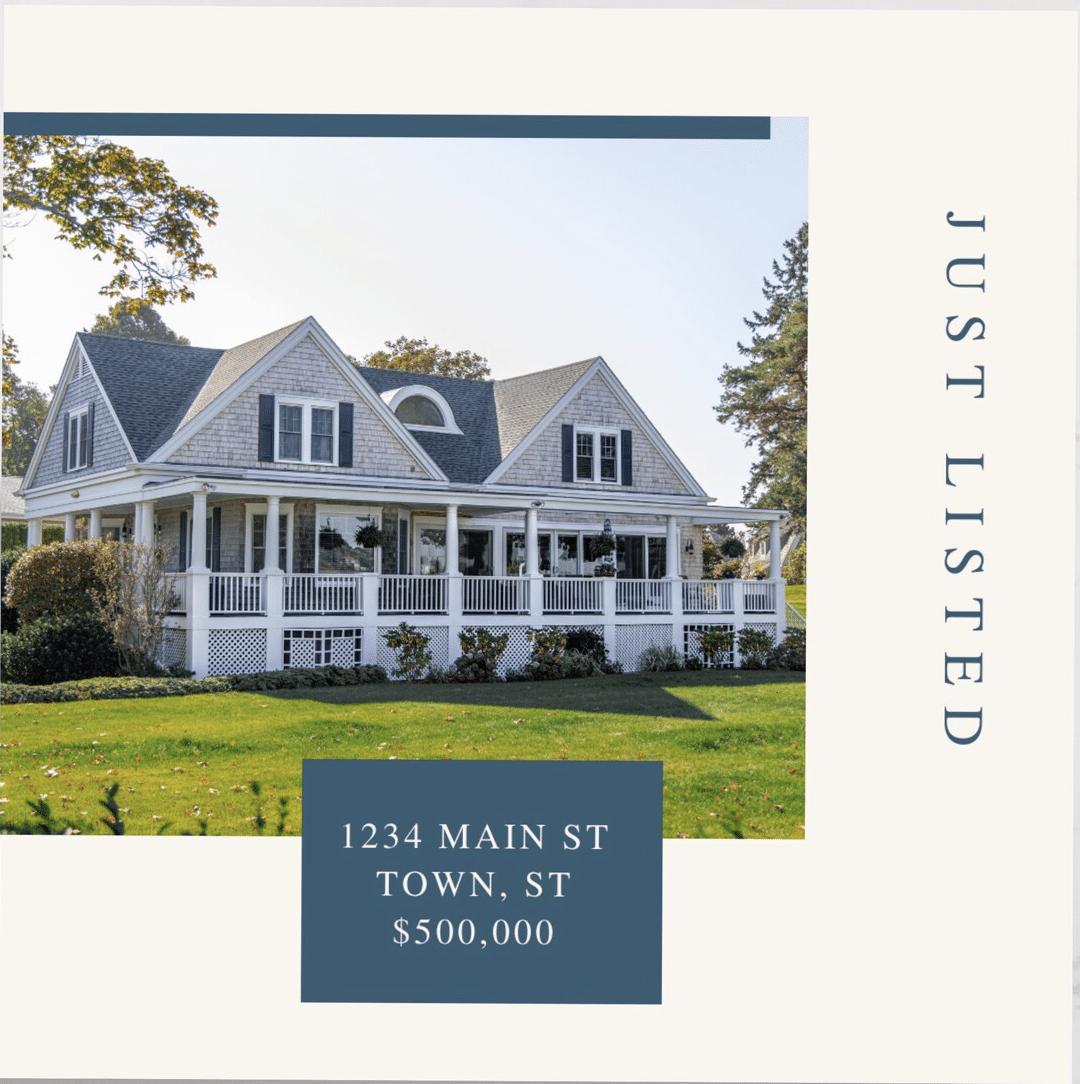
Lead Magnet: Private tour
Why This Copy Works: This ad is successful because of its simplicity. With the professional image, address, and price in an elegant font, you hardly need any other copy.
Why This Creative Works: This template could work for just about anyone. Bonus points for being adaptable; I could also see this same treatment for open house, under contract, or just sold real estate ads. Apply your brand colors and logo, and you’re all set.
7. Open House Ad
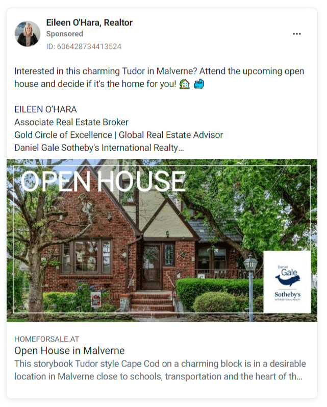
Lead Magnet: None
Why This Copy Works: Again, when it comes to writing great copy, simple > complicated. This copy gets right to the point. The two cute emojis also help it stand out without being overwhelming.
Why This Creative Works: Again, simple! Gorgeous photography, simple graphic design, and the company branding in the lower right corner.
8. Open House Ad: Example 2
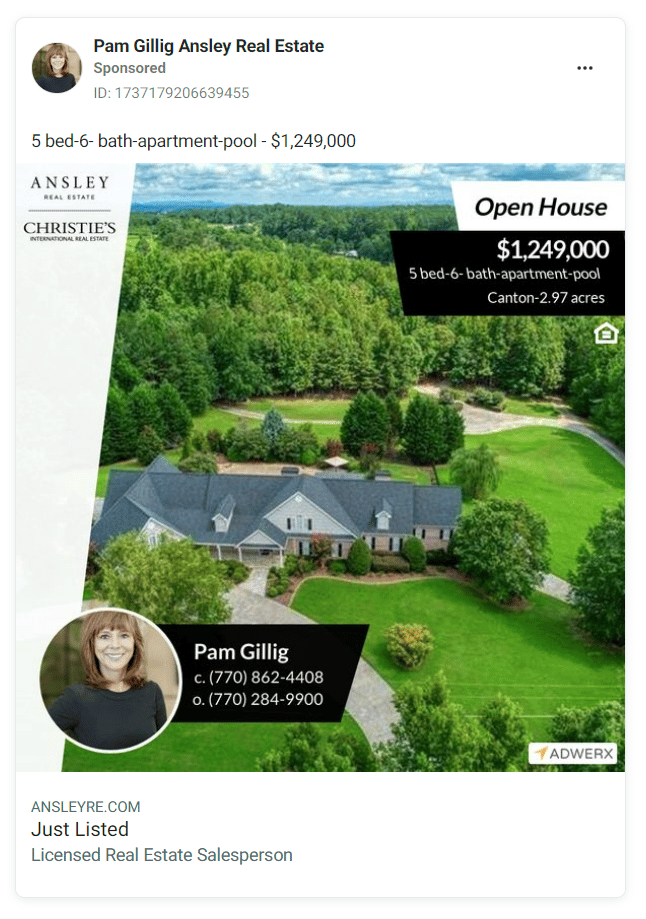
Lead Magnet: None
Why This Copy Works: There is virtually no copy in this ad. It relies almost entirely on the strength of its creative.
Why This Creative Works: Bold, clean design draws the audience’s eye into this ad. The headshot and contact information are on the lower left instead of the more traditional lower right, but it still works.
9. Buyer Lead Ad
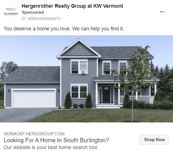
Lead Magnet: None
Why This Copy Works: With one just two short sentences, this copy plays on the audience’s FOMO and desire. Who doesn’t think they deserve a house they love? Then they offer their own website as the solution to the audience’s FOMO.
Why This Creative Works: Simple, simple, simple! Note how this is not a mega mansion, but a pretty basic home. It’s nice, but approachable.
10. Six Costly Mistakes Homesellers Make Ad
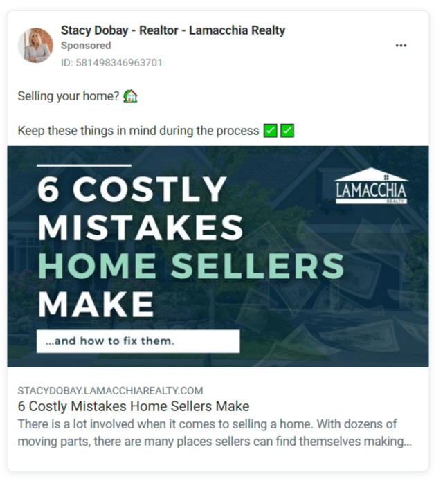
Lead Magnet: E-book
Why This Copy Works: This copy plays on the fears that every homeseller has before, during, and even after putting their home on the market. Even better, it offers a solution to help them get over those fears. Perfect!
Why This Creative Works: It’s not going to win any graphic design awards, but it certainly grabs your attention. Photography or graphics would just get in the way of this simple, powerful copy.
Ready to try ads on social media but don’t have the time to create, post, and test them? Check out Sierra Interactive’s Real Estate Ad Management tool. All you have to do is set the budget and they handle the rest!
Outdoor Real Estate Ad examples
Believe it or not, the outdoors is more than just what you walk through from your car to your listing. In fact, many people have the free time to go on long walks with their dogs, jog, ride bikes, and all manner of activities unknown to busy real estate agents!
That makes the great outdoors a prime place to reach those pesky leads who aren’t down with the Instachat or Snapgram or whatever latest app is at the top of the App Store charts. Here are some of our favorite examples of outdoor real estate ads that pack a punch.
11. Sense of Home Scratch & Sniff Ads
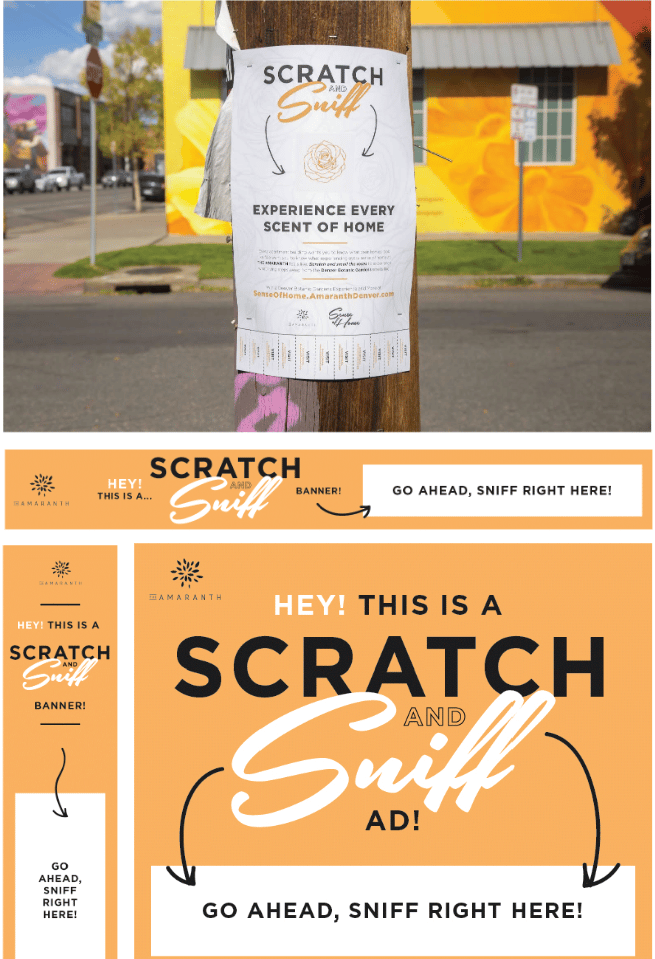
Why This Copy Works: These eye-catching and freshly scented scratch-and-sniff ads— designed by Agency Fifty3 for a new development in Denver, Colorado—are enough to make your average curious resident stop in their tracks. Once they’ve got your attention, the message behind these ads—that even new developments will become “home” rather than just a place to live—it really hits the mark.
12. Compass: Powering Your Home Search

Why This Copy Works: A great pun works wonders and this copy brings everyone in on the joke. These slickly designed and clever ads on electric car charging ports send the perfect message to the very kind of hip, upwardly mobile, and eco-conscious clientele every brokerage covets. That said, the (dead dinosaur-powered) Rolls Royce Phantom does seem suspiciously parked.
13. Stribling Building Listing Signs
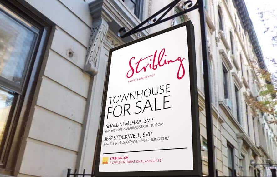
Why This Copy Works: This well-made listing ad signs leave a lot up to one’s imagination. We know there’s a townhouse for sale on a gorgeous, tree-lined street. Maybe that’s all we need. I like the mystery. The simplicity here lets the environment do the heavy lifting and the bright pink logo elevates the overall look, keeping the ad from feeling stale or boring.
14. Halstead Outdoor Ads
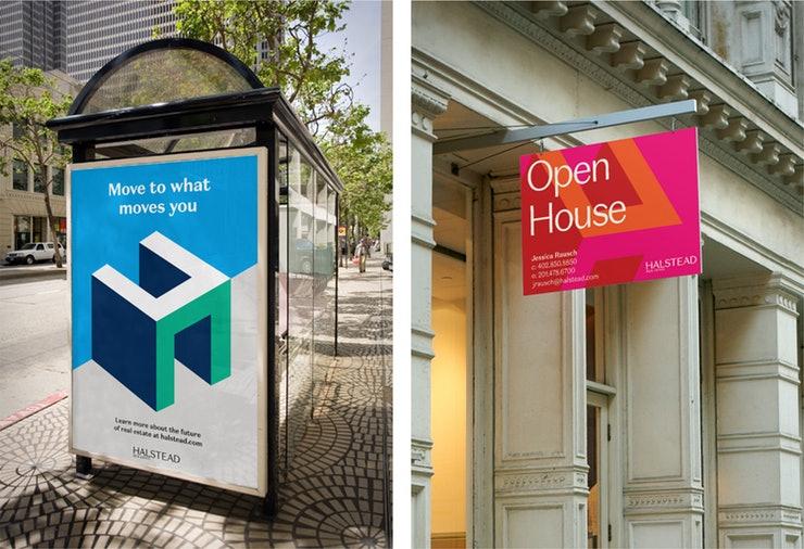
Why This Copy Works: In the first example, Halstead uses a clever play on words in hopes their audience will pause just one second longer. “Move to what moves you, huh? That’s clever. What’s this? Halstead? I’ll look into them.” This second example lets the bright poppy colors do the heavy lifting. It’s hard to ignore the vibrancy, and an open house with this chic of a sign is probably a property worth seeing.
15. Realtor.com Subway Ad
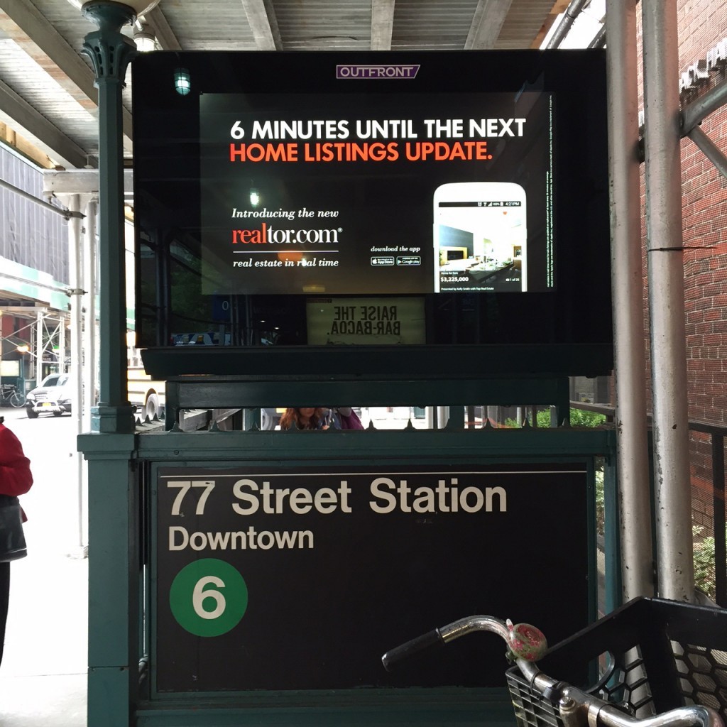
Why This Copy Works: Making a pun about the subway seems like something of a rite of passage (ha!) for advertising execs cutting their teeth on transit signage. Realtor.com’s ad here, on the other hand, is well thought out. The cheeky play on the ad’s placement—an LCD display that alternates between ads like this and upcoming subway departures—make this ad really stand out.
16. Realtor.com House Wrap Ad
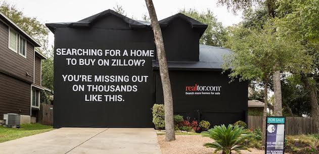
Why This Copy Works: This message uses FOMO to entice its audience to switch from Zillow to Realtor.com. A tried-and-true ad strategy, no one wants to miss out on something great. This is exactly the type of ad that can go viral and take on a life of its own. It’ll get people talking and sharing, and above all, checking out Realtor.com.
17. StreetEasy Subway Ad: ‘You’re Dead to Me!’

Why This Copy Works: This speaks to New York City or any other metro with a massive chip on its shoulder. It gives the audience confidence that the agency is in the know, speaks the language, and has true local bona fides. StreetEasy’s subway ads have always been clever, but these ads take an old-school monster fight from classic movies and insert humorous things that New Yorkers tend to argue about. In this case, moving to LA.
Print Real Estate Ad Examples
The rumors of print advertising’s death have been wildly exaggerated. In fact, some real estate agents still swear by the persuasive qualities of ink and paper. Are they right? Well, judge for yourself.
Here are a few examples of killer print ads that we bet have a great return on investment—or at least help grow brands.
18. Douglas Elliman: Ask Elliman
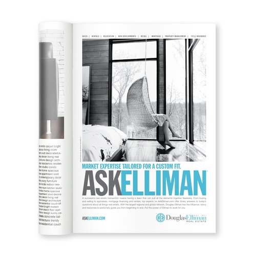
Why This Copy Works: Still one of our favorite real estate ad campaigns of the past few years, Douglas Elliman’s “Ask Elliman” campaign hits all the right notes. It manages to evoke expertise and care at the same time. The Elliman branded blue really pops against the shades of black, white, and gray. It has a slight nostalgic feel but in a modern setting, appealing to just about any audience.
19. National Association of Realtors (NAR): Most Valuable Square Inch
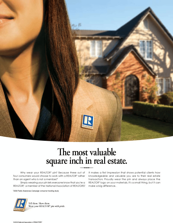
Why This Copy Works: This magazine ad makes the National Association of Realtors aspirational, if not damn near heroic. The copy creates a club that we want to be a part of (or that we want representing our interests). We don’t need to see the Realtor’s face to know she’s trustworthy, has integrity, and will sell this house. Or help you buy it. This is an ad that shows us as much as it tells us.
20. Lefferts Place Mews
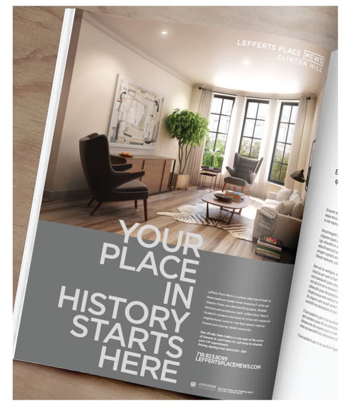
Why This Copy Works: Everyone wants their place in history. This copy makes us contemplate our legacy, our hopes, dreams, and maybe even hints that “life is short—buy the pretty house” argument. Of course, it works on a literal level as well—it’s a historic property.
21. Nourmand & Associates: New Hire Announcement
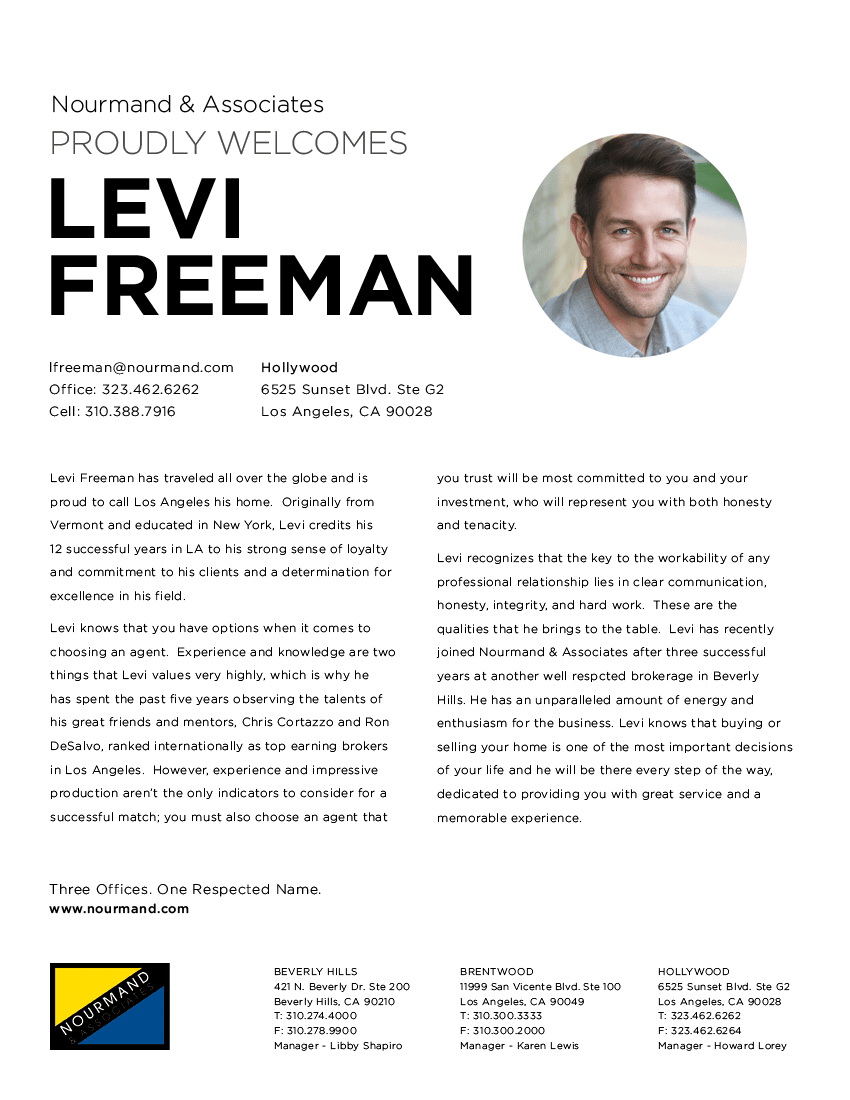
Why This Copy Works: OK, you’re probably wondering why I put a new hire announcement, of all things, on this list and I’ll admit it—it’s not really for the copy, it’s for the design. This example showcases why it’s crucial to sweat the small stuff to get ahead. The typography, layout, and imagery are all pinpoint perfect.
22. Compass: Door Hangers
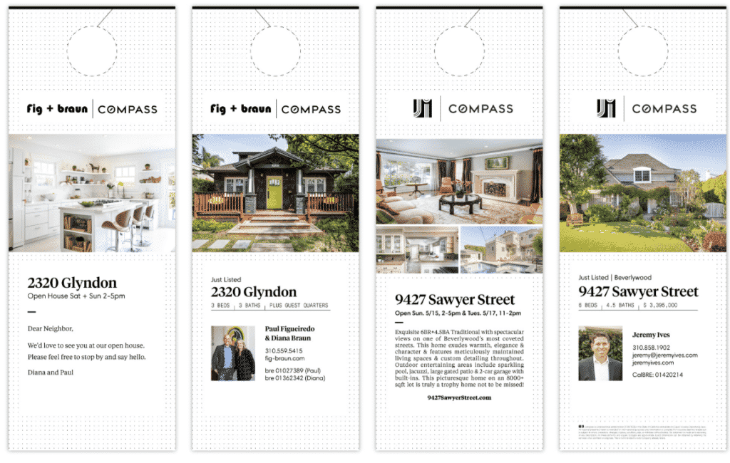
Why This Copy Works: Well-designed door hangers? Now I’ve seen it all! These just listed and open house door hangers for Compass were designed by I Design Creative. They keep the message simple and let the properties and headshots do the talking. Door hangers are often a check-the-box marketing tool, but if you take the time to think about layout, images, and overall design, they can make a huge impact. Instead of going right into the trash can, someone will pause, take in the beautiful property photos, and maybe even read that testimonial.
23. First Mallorca: Taylor Made Houses

Why This Copy Works: How clever are these ads for Mallorca-based luxury real estate firm First Mallorca? The “Taylor-made houses” line makes it. It’s a fresh approach to the idea that this brokerage is focused on the client as an individual. The image is really what works here, though, reinforcing the idea that each buyer or seller is as unique as the properties.
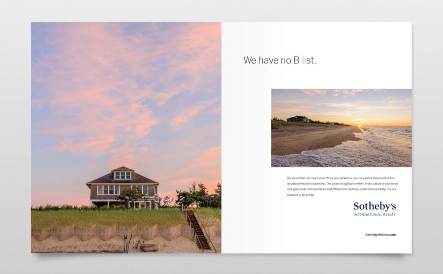
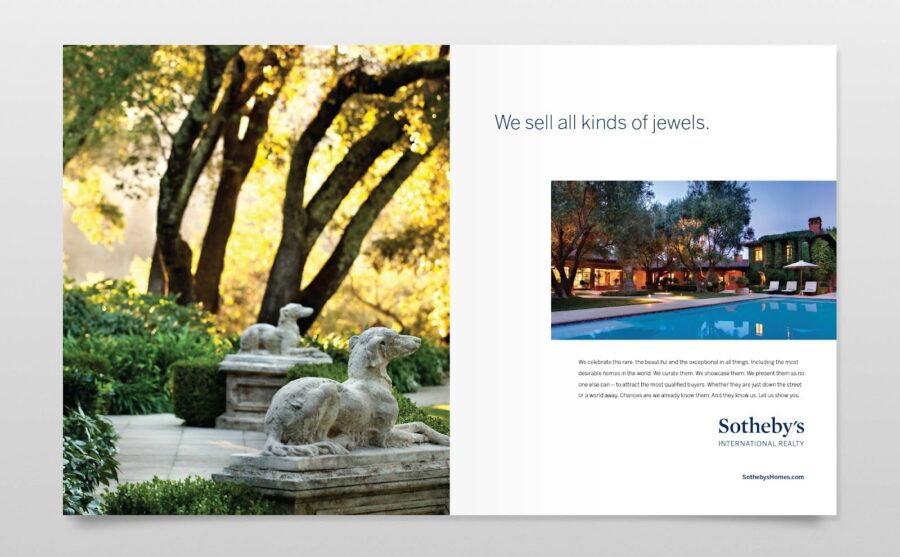
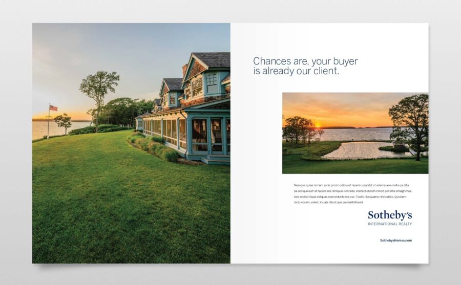
24. Sotheby’s International Realty
Why This Copy Works: Clean, classic, eye-catching images and pithy copy—everything you need to get the most out of a two-page layout. This Sotheby’s campaign is all about creating a vision of a lifestyle that feels both aspirational and familiar.
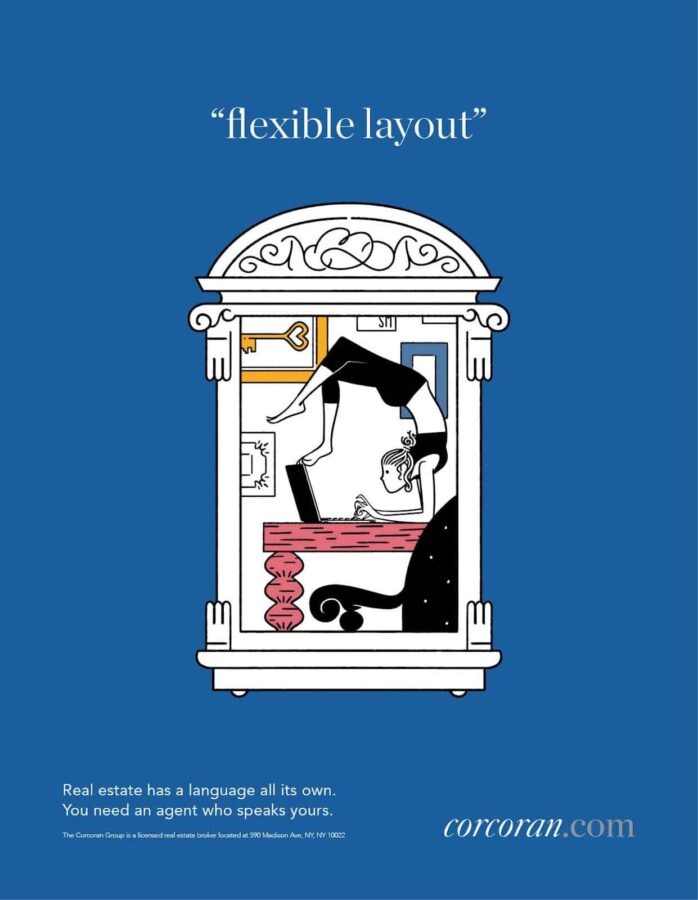
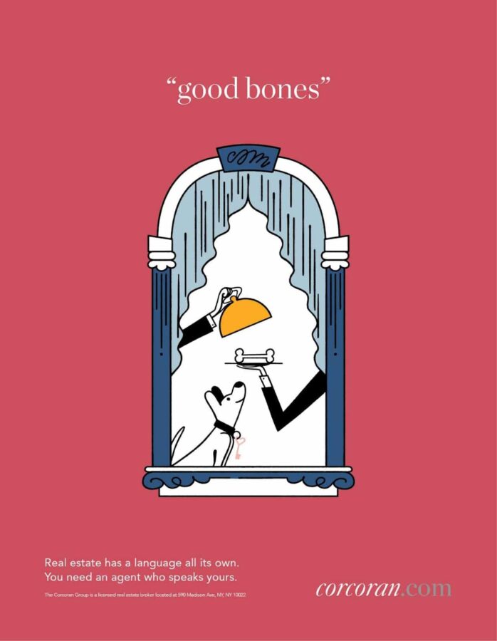
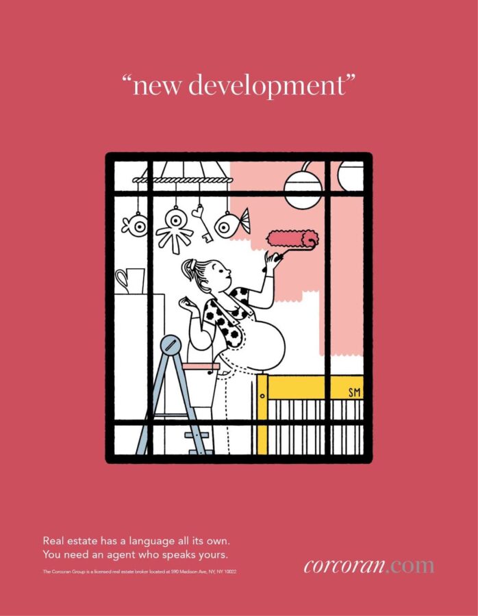
25. Corcoran’s ‘Live Who You Are’ Campaign
Why This Copy Works: I’m enchanted by this whimsical take on Corcoran’s core statement, which celebrates the life you’ll live in your new home. These illustrations by Simone Massoni manage to be fun and clever, while still evoking emotion. Other Corcoran print campaigns showcase photography by Rob Howard, Annie Liebovitz, Paul Costello, and Stefan Anderson. The Corcoran brand believes that storytelling fosters loyalty, and I agree.
If we had to pick a single real estate brochure company to recommend, it would be ProspectsPLUS!. ProspectsPLUS! has marketing print collateral in just about every format and size, plus there is no membership fee. Some providers require a monthly subscription to access designs, but ProspectsPLUS! works well for one-off projects and ongoing campaigns.
Real Estate Brand Promotional Items
Your headshot, logo, and other branding can be used on promotional items as well as other forms of advertising. These give-aways remind leads and clients of your professionalism, skill, and dedication.
26. The Helpful Branded Fridge Magnet
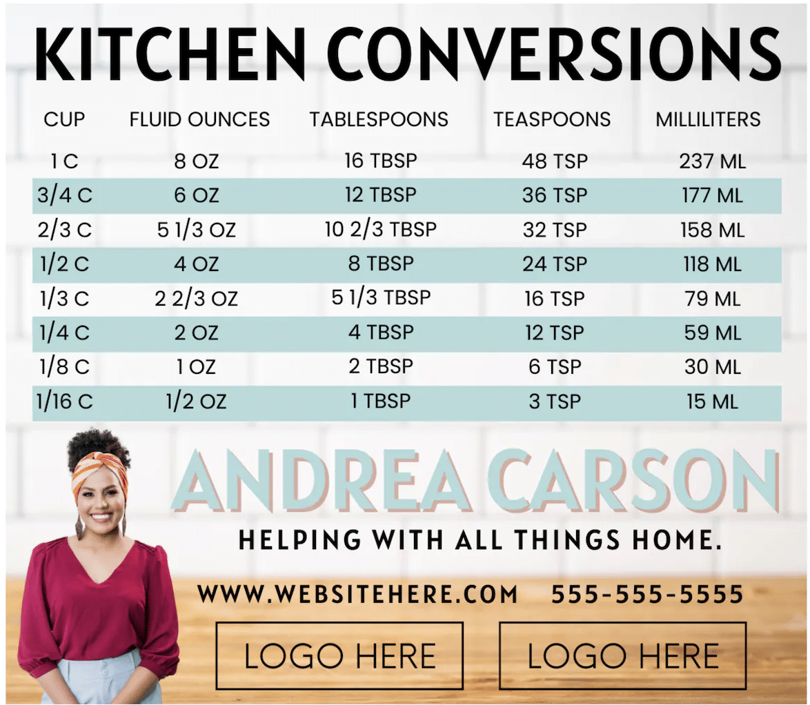
Why This Creative Works: I’m a big fan of any promotional item that has longevity. This helpful, well-designed magnet will live on the fridge, reminding leads that one cup equals 8 ounces and that you are there any time, day or night, to help with all things real estate.
27. Custom Mug of Your Mug
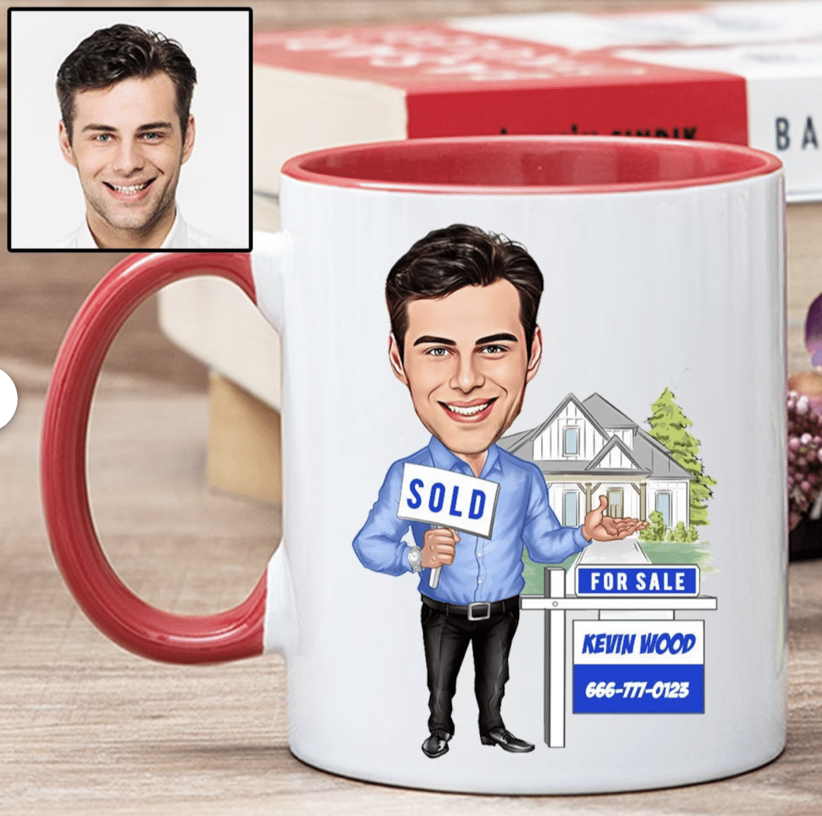
Why This Creative Works: Branded mugs are nothing new, but this illustrated mug shows off a little personality, and has the chance of sticking around during all of the kitchen clean-outs.
28. Brokerage Ready-to-Wear Line
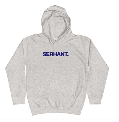
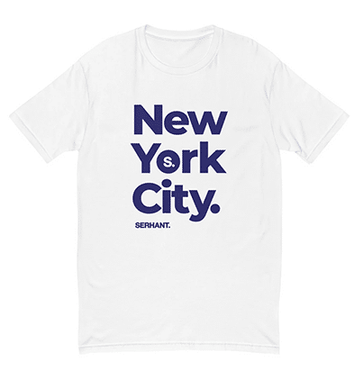
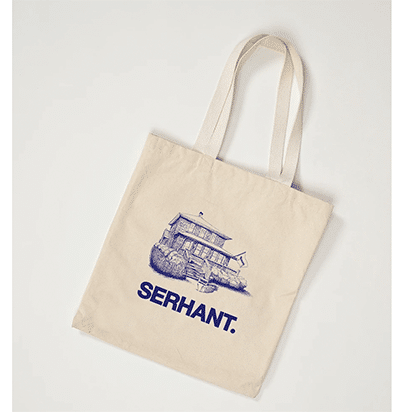
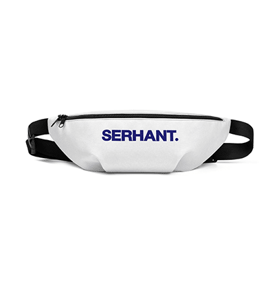
Why This Creative Works: Sometimes your brand is all you need to make a statement. It helps when there’s an emphatic period at the end. This SERHANT. hoodie sweatshirt is classic, warm, and brilliant advertising. Imagine people walking around wearing your brokerage name on their clothing, hats, fanny packs, or even swim trunks—doesn’t get much better than that.
Bringing It All Together
Have some impactful, effective real estate ads that you want to share? Have insights about trends leading into next year? Let us know in the comment section.


